Design Experiments
A sandbox for exploring visual design systems, widgets, and layouts
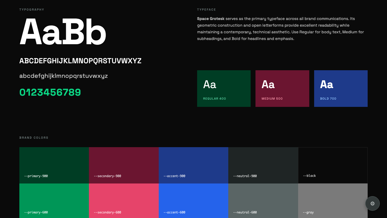
Stratum
Interactive brand guidelines with React-powered color customization. Click the gear icon to open a push-in sidebar with live color editing - changes apply instantly across the entire page. Features composable Card components with context-based inheritance, semantic color naming, Chroma.js scale generation, and real-time CSS variable updates that persist via localStorage.
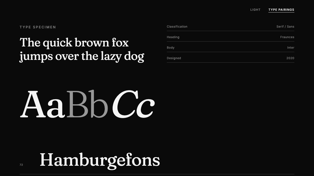
Spec Sheet
Type specimen sheet with interactive font pairing selector. Features size scale, weight ramp, character set display, drop cap pull quote, and colorful pairing cards inspired by the Color Spec experiment. Text-based controls with underline hover animations.
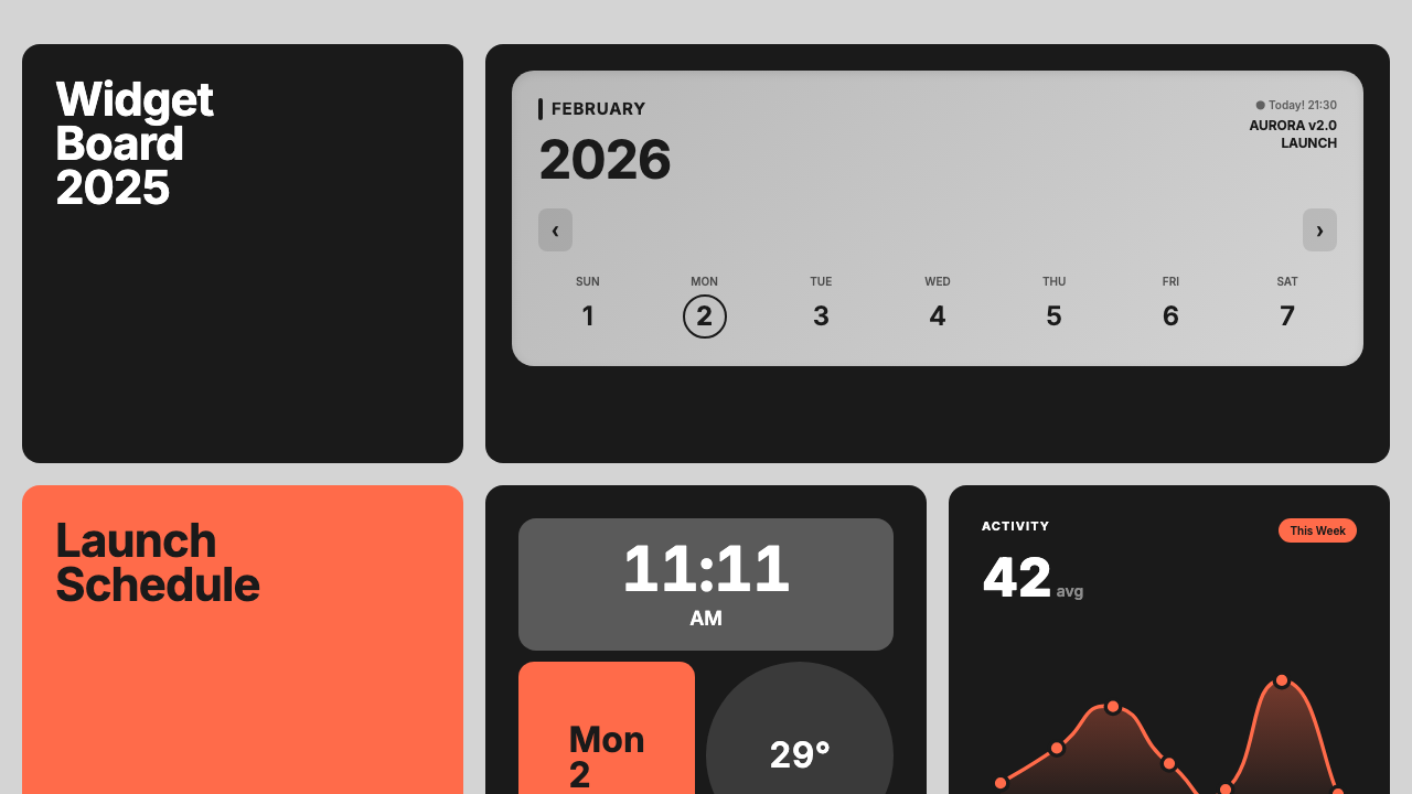
Design Festival
Card-based layout system combining festival poster boldness with digital interface precision. Features animated React widgets including an Activity chart with SVG line-drawing animation, Goals progress bars, Analytics bar charts, and click-to-regenerate interactions.
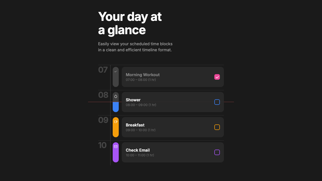
Day at a Glance
Clean 3-column CSS grid timeline with colored sidebar bars, SVG icons, and a subtle "now" indicator line that shows through semi-transparent event cards. Features split color bars for past/upcoming visualization.
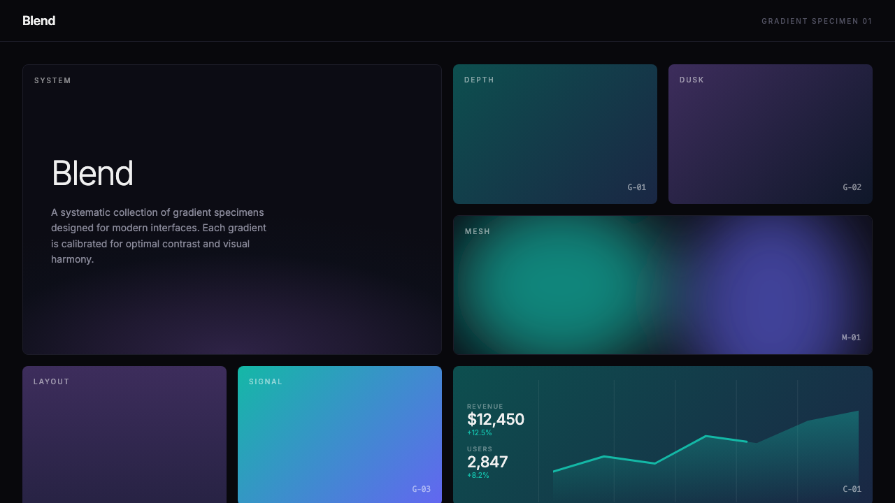
Blend
Swiss modernist gradient specimen system featuring organic mesh gradients via SVG blur technique. Includes 27 gradient cards across linear and mesh styles, systematic labeling, scroll-triggered animations, and an analytics dashboard mockup.